WHITE. IT SHOULD BE THE EASIEST PAINT COLOUR TO CHOOSE SHOULDN’T IT? BUT ANYONE WHO’S GONE THROUGH THE EXERCISE KNOWS IT’S TRICKY.
There are warm whites and cool whites, and the amount of natural light flooding into a space will have a significant impact too. Who knew that cooler whites with their blue undertones worked better in a naturally light-filled room than warmer whites with their yellow undertones. Then there’s the lighting you choose to use – LED, halogen, lamps, directional light… It’s a bit of a minefield, and even Taliah Lowry, BBA’s creative director, who has been using whites as part of her sophisticated design aesthetic for years was challenged when it came to choosing the perfect white for BBA’s most recent new builds – The Lodge and The Cabin.
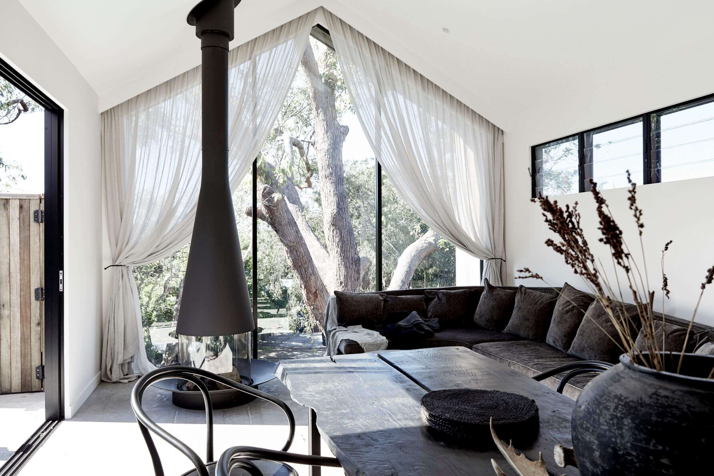
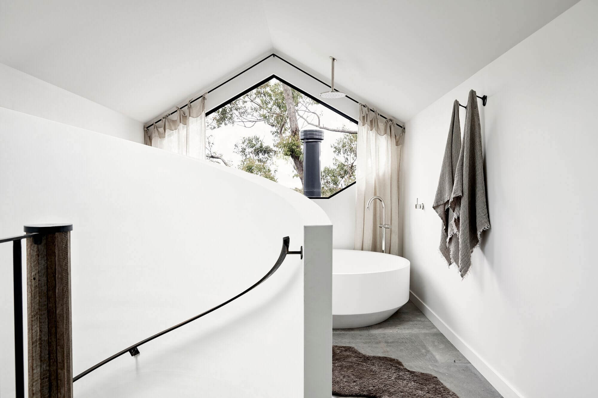
And her go-to? Porter’s Paints. They’ve been crafting hand-made paints for more than 35 years, starting with using old, traditional European paint recipes found in a Sydney house painter’s grandfather’s diaries. The painter was Peter Lewis and his grandfather was Fred Porter. It’s a lovely story of creativity, entrepreneurship, appreciation of beauty and the need for the bespoke. It’s our kind of story, and it was Taliah working side-by-side with Porters creative team that saw the development of Byron White, the colour she’s used through these simply stunning new builds.
We also love that Porters have a commitment to minimising the impact on the environment and are also the founding participants in PaintBack, a national waste paint collection and treatment scheme for leftover paints and packaging. Yep. They’re BBA kind of people.
See the results of the collaboration between Porters and Taliah which has delivered ‘one of the most tranquil (and chic) places in Australia.’
Featuring Taliah Lowry, Creative Director at Byron Beach Abodes, @byron_beach_abodes
All photos by Jessie Prince @jessiexprince
Video produced by Broadsheet in partnership with Porter’s Paints.


